
Table of Contents
- What Makes High Quality Screen Printing Stand Out
- Visual Inspection: Sharpness, Registration, and Color Saturation
- The Feel Test: Hand-Feel, Opacity, and Ink Coverage
- Screen Printing vs Direct to Garment: Key Differences
- Signs of Bad Screen Printing to Avoid
- How to Tell If a Shirt Is High Quality Beyond the Print
- Tactile Testing Methods for Accurate Assessment
- Quality Control for Bulk Orders
- Frequently Asked Questions
Last Updated: September 2, 2026
What Makes High Quality Screen Printing Stand Out
High quality screen printing isn't just about how the design looks fresh out of the box, it's about how it holds up over time, how it feels against your skin, and whether colors stay vibrant or fade. Understanding what separates high quality screen printing from mediocre work means knowing what to look for when you inspect a shirt in person or when it arrives at your door.
Why Print Quality Matters to You
A poorly printed shirt signals corner-cutting. For rock enthusiasts aged 30-65 who've collected band merchandise for decades, quality is non-negotiable. High quality screen printing means the design stays bonded to the shirt, not something that flakes off. The ink bonds properly to the fabric, colors remain true, and the print maintains its texture and definition. When wearing a vintage-inspired graphic tee celebrating a legendary guitarist, you want people to see the design clearly, not squint at a faded ghost.
Visual Inspection: Sharpness, Registration, and Color Saturation
The moment you hold a shirt up, the quality of the print becomes obvious to anyone who knows what to look for. Visual inspection reveals whether the printer invested in proper equipment, quality inks, and the skill to execute the design correctly.
Check for Sharp Edges and Clear Lines
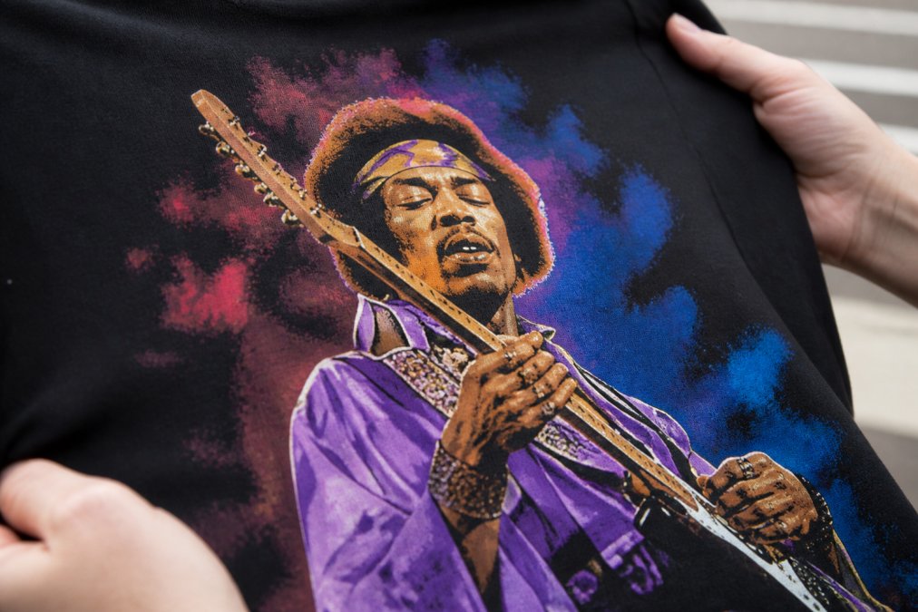
Run your eyes across the design edges. Sharp edges are the hallmark of high quality screen printing. When ink deposit is controlled properly and screen tension is correct, boundaries between colors stay crisp and defined. Blurry edges, feathering, or ink that bleeds beyond intended lines indicate poor screen quality, incorrect squeegee pressure, or rushed production.
Look at fine details, thin lines, small text, and intricate patterns. These should be clean and legible, not filled with extra ink or broken into disconnected pieces. A printer using proper halftones and raster techniques maintains these details across the entire print. If you see inconsistency, sharp in one area, blurry in another, that signals uneven screen tension or inexperience.
Sharpness depends on the original file resolution. Designs from low-resolution sources print with soft, pixelated edges regardless of printer skill. High quality screen printing starts with a high-resolution vector or properly prepared raster file, typically 300 DPI minimum.
Evaluate Registration Accuracy
Registration is the alignment of multiple colors in a design. When each color layer prints exactly where it should, the design looks intentional and professional. When registration is off, colors overlap incorrectly, creating a blurry or distorted appearance.
To check registration, look at any area where two colors meet. The boundary should be clean and aligned. If the red sits slightly to the left of where it should meet the blue, or if there's a visible gap between colors, that's a registration error. This happens when screens aren't properly aligned during printing or when the garment substrate shifts during production.
High quality screen printing operations use precise registration marks and careful screen positioning to ensure every color layer lands exactly where it belongs. This is especially critical for designs with multiple colors or intricate patterns.
Assess Color Saturation and Vibrancy
The colors should pop. High quality screen printing delivers vibrant, saturated colors from quality plastisol or water-based inks with proper pigmentation, correct ink deposit, and proper curing temperature. Faded, washed-out colors indicate cheap inks, insufficient coverage, or improper curing.
Hold the shirt up to natural light and against a dark background. Colors should maintain their intensity and hue. Pantone color matching ensures colors match the designer's intent, not some approximation. The saturation depends on the under-base, a layer of white or clear ink printed first to provide a foundation for colors above. Without a proper under-base, colors on darker fabrics lose vibrancy and appear dull.
The Feel Test: Hand-Feel, Opacity, and Ink Coverage
Once you've inspected the visual qualities, touch the print. Your fingers will tell you whether the ink was applied with restraint and skill or dumped onto the shirt in a heavy, plasticky layer.
Run Your Fingers Across the Print
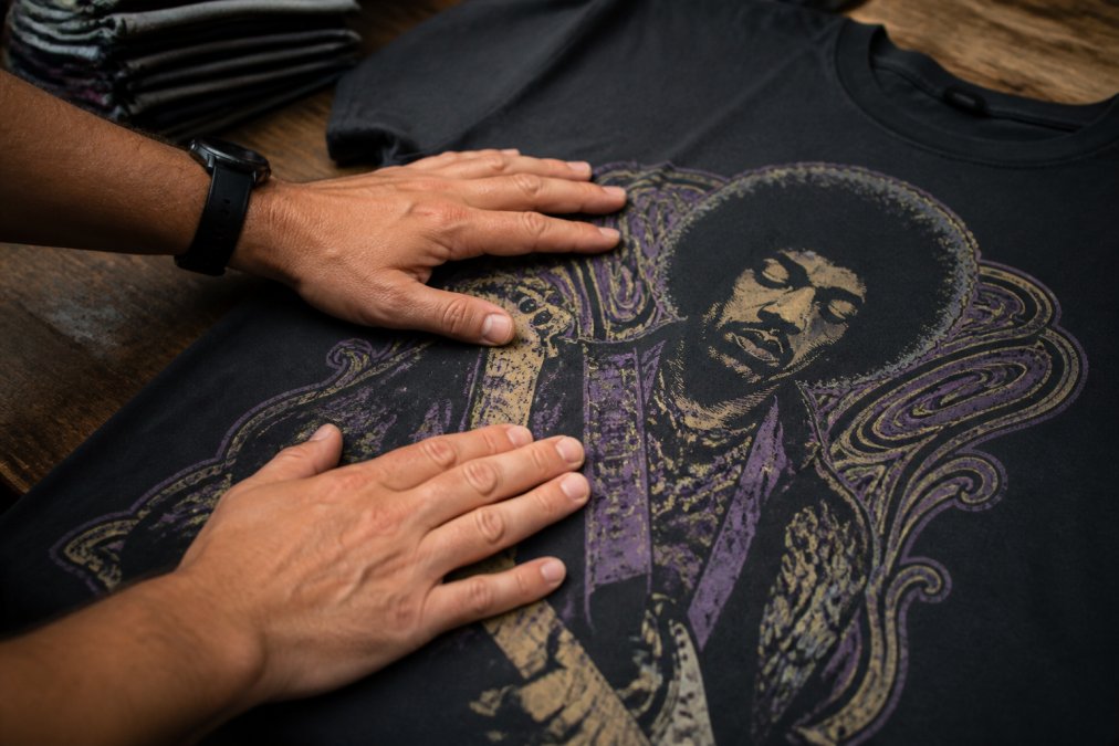
The hand-feel of a high quality screen print should be smooth, flexible, and barely perceptible. The design should feel like a natural part of the shirt, not a separate layer sitting on top. When you bend the fabric, the print should flex with it, not crack or peel.
Excessive ink deposit creates a stiff, uncomfortable print that feels like plastic. Proper opacity can be achieved with controlled ink application. A skilled printer uses the right squeegee pressure, mesh count, and screen tension to deposit just enough ink for full coverage without creating a heavy, inflexible layer.
Run your fingernail lightly across the design. A quality print won't flake or crack under light pressure. If ink comes off on your finger, that signals poor curing, the ink wasn't heat-set properly and won't survive washing. The print should feel bonded to the fabric, not sitting loosely on the surface.
Check Ink Opacity and Deposit
Opacity is the degree to which ink covers the garment substrate without allowing fabric color to show through. Full opacity means the design color is exactly what you see, unaffected by the shirt color underneath. For most designs on lighter garments, full opacity is standard. On darker garments, an under-base is often necessary to achieve full opacity without excessive ink.
The ink deposit should be consistent across the entire design. Thin spots indicate uneven squeegee pressure or worn screens. Thick spots suggest the printer is compensating for equipment issues rather than fixing the root cause. Consistency marks proper maintenance and skilled execution.
Screen Printing vs Direct to Garment: Key Differences
Direct to garment (DTG) printing is sometimes positioned as an alternative to screen printing, but they serve different purposes. Screen printing uses mesh screens and ink applied through stencils, ideal for bold designs, vibrant colors, and durability. Each color requires a separate screen, making screen printing excel at spot process printing and designs with solid color areas. The ink sits on top of the fabric, creating a tactile, visible design that ages beautifully.
DTG printing uses specialized inkjet printers that spray ink directly onto the garment. This method works well for photorealistic images and complex color gradients. However, DTG prints can fade faster with repeated washing because ink penetrates the fabric rather than sitting on top. For classic rock graphics with bold colors and strong visual impact, screen printing delivers superior longevity, color vibrancy, and hand-feel.
Signs of Bad Screen Printing to Avoid
Not every screen printed shirt is created equal. Learning to spot warning signs of poor quality saves you from wasting money on prints that won't survive a few washes.
Cracking, Peeling, and Fading After Washing
A shirt printed with proper curing and quality inks should survive dozens of washes without visible degradation. If the design cracks after a few washes, that signals improper curing temperature or insufficient heat exposure. The ink didn't fully polymerize, so it remains brittle and prone to breaking when fabric flexes.
Peeling indicates the ink never bonded properly to the garment substrate. This happens when fabric isn't prepared correctly, the ink isn't compatible with the fabric type, or the curing process is rushed. Fading suggests inks lack quality pigmentation or curing temperature was too low. High quality plastisol inks maintain their color through many wash cycles.
Ink Bleeding and Poor Color Matching
Ink bleeding occurs when design edges blur or colors seep into adjacent areas. This is a registration and screen quality issue. If screens aren't held at proper tension or the printer doesn't maintain precise alignment, ink bleeds beyond intended boundaries.
Poor color matching means printed colors don't match the design reference. This happens when the printer doesn't use Pantone color matching, relies on old or degraded inks, or doesn't properly calibrate equipment.
Inconsistent Print Thickness and Coverage
When you inspect multiple shirts from the same order, prints should look identical. Inconsistency in thickness, color saturation, or registration indicates poor quality control. Thin coverage in some areas while others are heavy suggests inconsistent squeegee pressure or worn screens, compromising durability.
How to Tell If a Shirt Is High Quality Beyond the Print
The print quality matters, but the shirt itself is equally important. A beautiful design on a cheap, thin garment won't deliver longevity or comfort you deserve.
Examine Fabric Weight and Garment Substrate
Quality apparel starts with quality fabric. Feel the weight of the shirt. A substantial, well-made tee has heft and density. Heavier fabric, typically 6 ounces or more for a standard t-shirt, indicates better construction and durability (astm.org). A cotton-polyester blend often performs better than 100% cotton, offering improved durability and color retention.
Check the seams. Quality construction means straight, even seams with proper stitching. Loose threads, uneven stitches, or hastily done seams are red flags. The neckline and armholes should be reinforced with binding or stitching that won't unravel after a few washes.
Test Wash Durability and Longevity
The real test of a shirt's quality comes after multiple washes. A high quality screen printed tee should look nearly identical after 20 washes (astm.org). The design should maintain sharpness, colors should stay vibrant, and the fabric should retain its shape and texture.
Wash durability depends on both print quality and garment quality. A premium print on cheap fabric still fails because the fabric deteriorates. When evaluating a shirt before purchase, ask about wash testing. If a retailer can't speak to wash durability or hasn't tested their products, that's a warning sign.
Tactile Testing Methods for Accurate Assessment
Beyond visual and basic tactile tests, specific methods assess print quality with precision. Start with the bend test: fold the design area gently and hold for a few seconds. Release and examine the fold line. A quality print flexes with the fabric and shows no cracking or separation.
Try the scratch test lightly using your fingernail on an inconspicuous area. Quality ink won't flake or chip. Examine the print under bright light from different angles to reveal inconsistencies in coverage, thin spots, and registration errors. Feel the print edges, they should be smooth and well-defined, not rough or feathered.
Quality Control for Bulk Orders
If you're ordering multiple shirts, quality control becomes critical. Reputable printers implement quality control checkpoints throughout production, inspecting prints at regular intervals and verifying curing temperature.
When ordering in bulk, request a sample or pre-production proof. Ask questions about the printer's quality control process. For large orders, consider requesting a quality assurance report documenting the testing performed. Keep documentation of your order specifications, colors, design file, and garment type. A quality printer welcomes this accountability because they're confident in their output.
Spotting high quality screen printing isn't complicated once you know what to look for. Visual inspection reveals sharpness, registration, and color saturation. Tactile tests expose ink coverage, hand-feel, and durability issues. Garment quality determines whether the print has a foundation worth printing on. When shopping for vintage-inspired music apparel celebrating classic rock, these assessment methods ensure you invest in something that looks great and lasts through years of wear. Tim Cosgriff Art applies these same standards to every graphic tee we produce, combining quality printing techniques with premium garments so your passion for legendary musicians stays visible and vibrant.
Frequently Asked Questions
How can you tell the difference between screen printing and digital printing?
Screen printing creates a raised, textured ink layer with visible hand-feel and distinct edges, while digital printing sits flat on the fabric surface. Screen printed designs show crisp registration lines and thicker ink coverage, especially visible under light. Digital prints feel smoother and more integrated into the fabric. For band tees, screen printing typically offers superior durability and the authentic vintage aesthetic that rock fans expect from premium apparel.
What are the signs of a poorly cured screen print?
Poorly cured prints crack, peel, or fade within a few washes. The ink may feel sticky or tacky to the touch immediately after purchase, indicating incomplete curing in the heat tunnel. Look for ink bleeding into surrounding fabric areas, uneven color saturation, or a print that appears dull rather than vibrant. Wash fastness suffers when curing temperature or dwell time is insufficient, compromising print longevity and making the shirt unwearable after just a handful of washes.
Is screen printing the highest quality method for apparel?
Screen printing is considered the gold standard for durability and visual impact on apparel, especially for bold, multi-color designs. It delivers superior wash fastness, vibrant color saturation, and that authentic tactile feel prized by collectors. However, the quality depends heavily on execution: mesh count, squeegee pressure, ink type (plastisol vs water-based), and curing parameters all affect the final result. Properly executed screen printing outperforms direct-to-garment methods in longevity and hand-feel, making it ideal for premium band merchandise.
Does the feel of the ink indicate print quality?
Yes. High-quality screen prints have a smooth, flexible hand-feel that doesn't crack when you flex the fabric. The ink should feel like a permanent layer bonded to the garment, not sticky or rubbery. Run your fingers across the design: premium prints show consistent thickness and no sharp edges that catch. Poor prints feel thick and brittle, crack at the edges, or have an uneven, waxy texture. The hand-feel directly reflects ink deposit, opacity, and curing quality, making it a reliable tactile test for overall print quality.
This article was written using GrandRanker